
Portfolio
It's been a humbling experience to see my work come from concept to existence. Even moreso to be able to tell people I had a hand in designing the unique experiences they may already know. My clients are proud of the work I've done and boast it proudly in local and national venues.
The Bourse
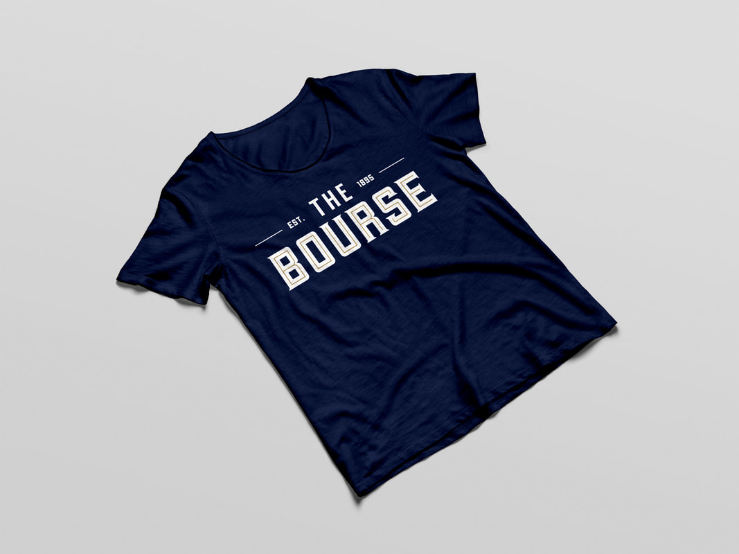
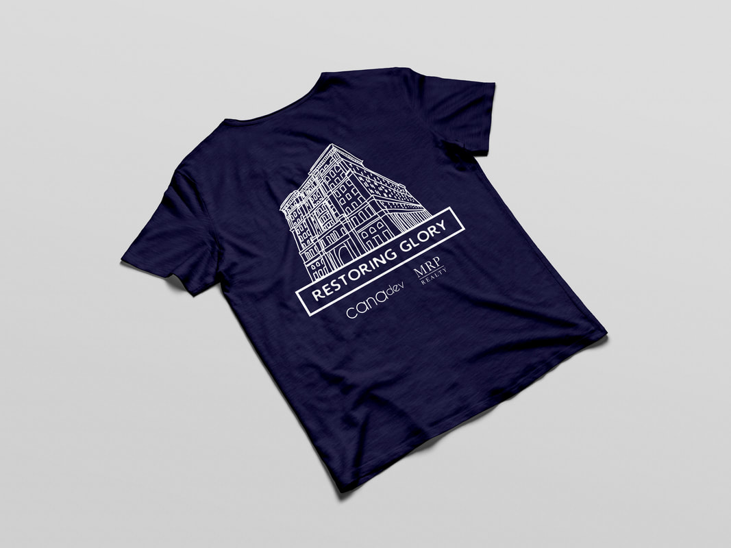
A referral from a current client lead me to working with developing promotional t-shirts for The Bourse's grand reopening. They wanted a simple statement that highlighted the building and their "Restoring Glory" tagline. A hand drawn rendering of the building was used.
Due to the success of the t-shirt, Cana Development reached out again with requests for wayfinding in the form of a map for the 29 vendors and a promotional passport. The map included development of neighborhoods to help section off and tackle the 29 vendors. Each neighborhood represented a portion of The Bourse's past (homage to the stocks, commodities, and maritime exchanges).
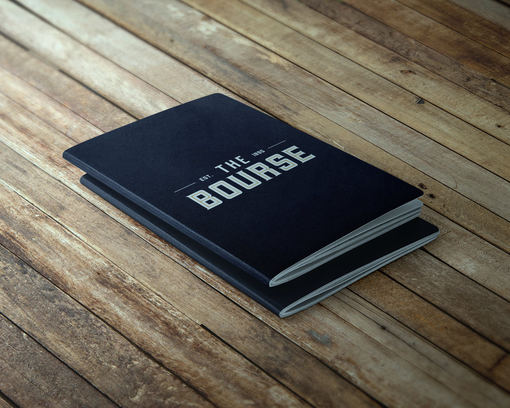
The 53 page passport included the same neighborhood configurations as the map and included a description of each vendor, place for stamp, logo, and menu highlights. Littered throughout the pages are fun facts about The Bourse's history.
A referral from a current client lead me to working with developing promotional t-shirts for The Bourse's grand reopening. They wanted a simple statement that highlighted the building and their "Restoring Glory" tagline. A hand drawn rendering of the building was used.
Due to the success of the t-shirt, Cana Development reached out again with requests for wayfinding in the form of a map for the 29 vendors and a promotional passport. The map included development of neighborhoods to help section off and tackle the 29 vendors. Each neighborhood represented a portion of The Bourse's past (homage to the stocks, commodities, and maritime exchanges).
The 53 page passport included the same neighborhood configurations as the map and included a description of each vendor, place for stamp, logo, and menu highlights. Littered throughout the pages are fun facts about The Bourse's history.
Tinsel
4 week long Christmas themed establishment decorated in gaudy decorations to get people in the holiday spirit.
To differentiate and put a new spin on the concept, a vintage theme was introduced. Cards, Menu, Window Display and video were part of the promotional package.
To see the how the work took off feel free to check out here, here, here, or even here (for a national story cover).
|
|
Maison 208 & The Social
Restaurant concept on 13th and Chancellor incorporating elements of masculinity and femininity through modern fonts and sketchy elements to support the mural incorporated in the restaurant's decor.
The Social was a sub brand to differentiate the more relaxed and less restaurant-oriented upstairs space that encouraged socialization. Similar fonts and correlative components were used to support the main brand of Maison 208.
To see the work in action check out here or here.
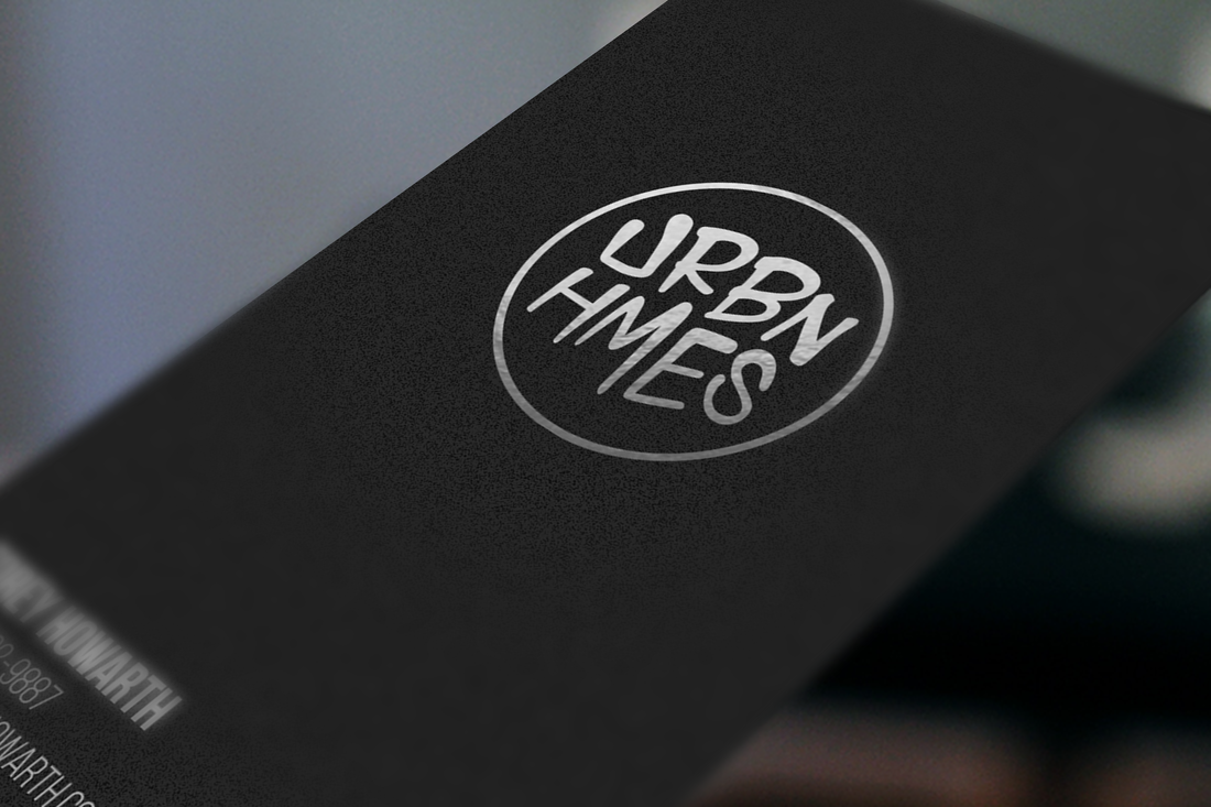
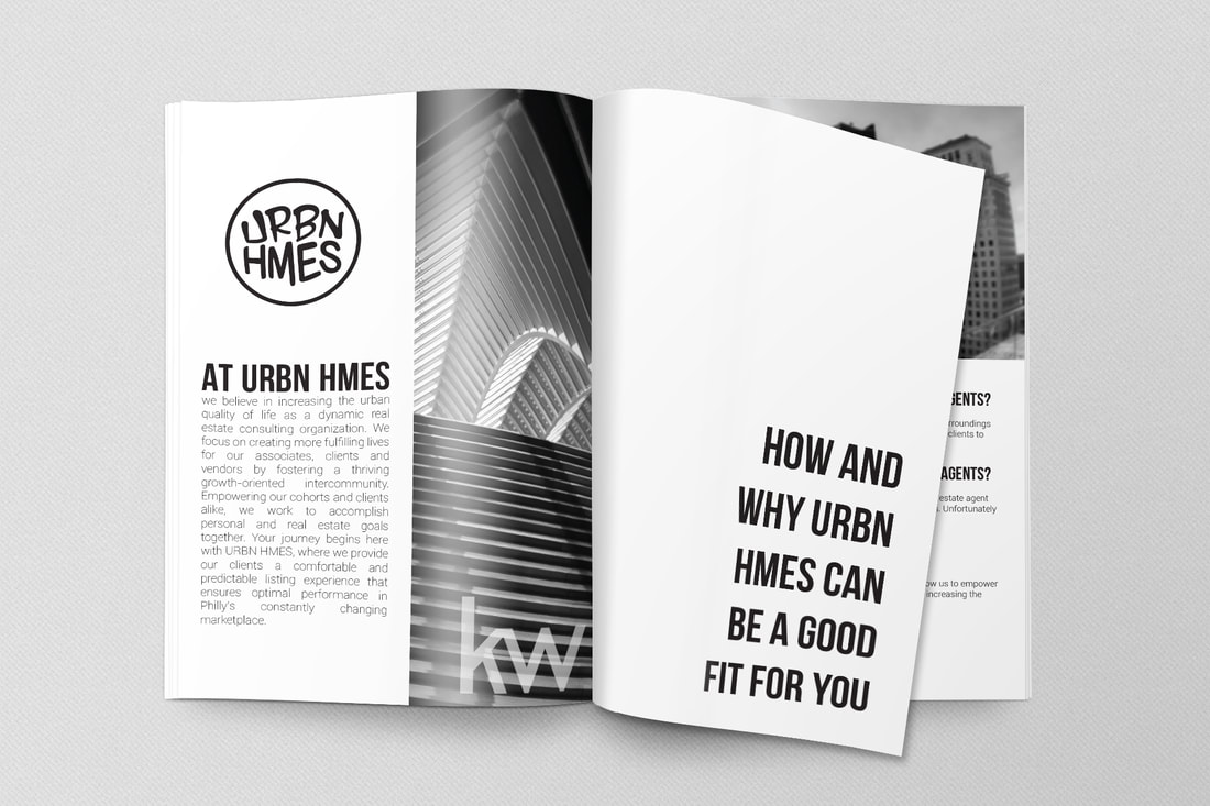
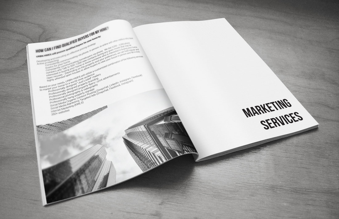
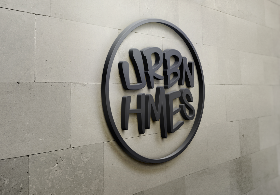
URBN HMES
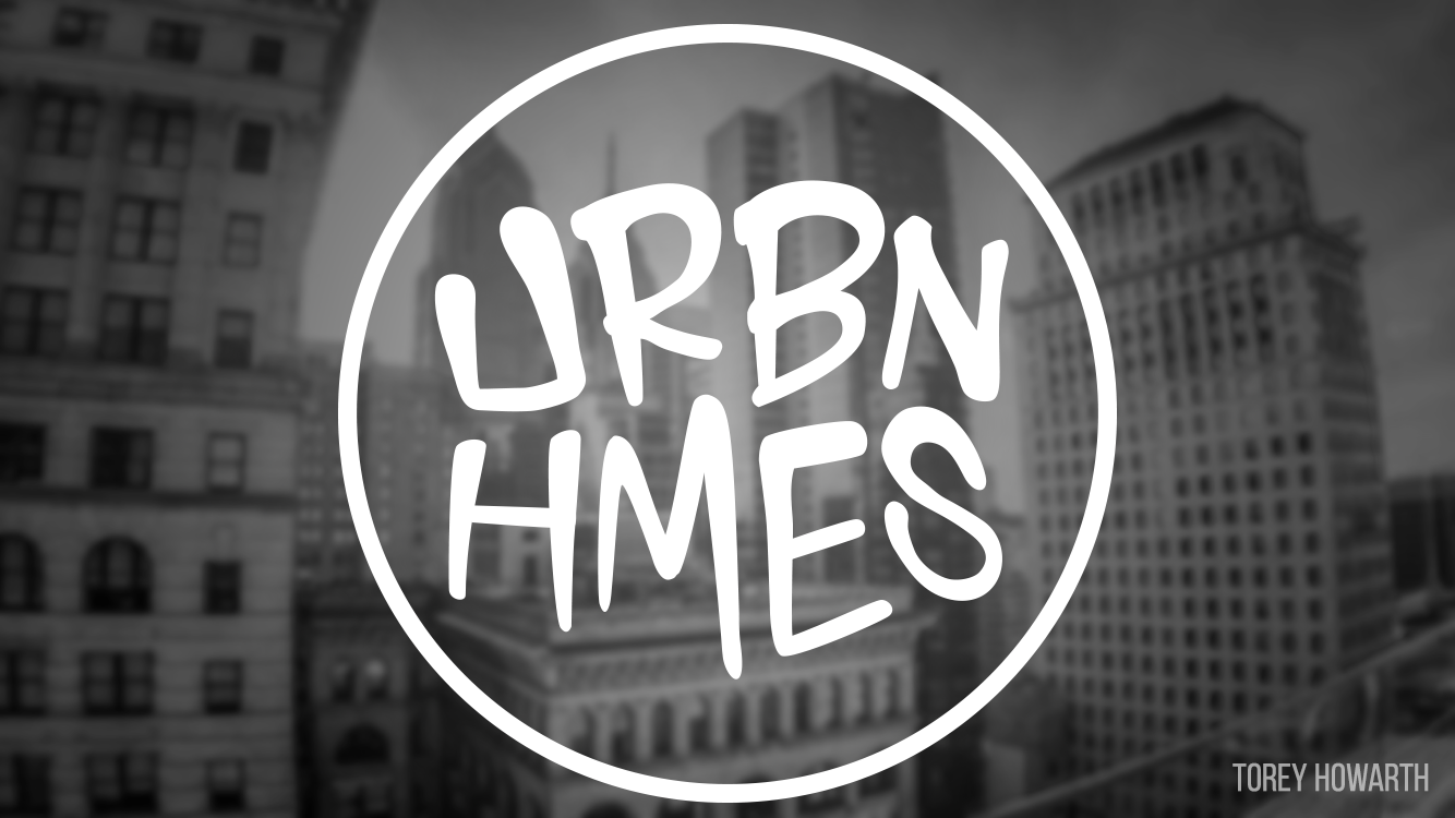
This was a branding project that was created for a real estate brand geared to urban millennials. Client wanted an urban feel without utilizing skyline facades that incorporated a professional feel that didn't alienate clients outside of millennial market. Solution was to create a custom toned-down graffiti style font and utilizing a monotone color scheme.
This was a branding project that was created for a real estate brand geared to urban millennials. Client wanted an urban feel without utilizing skyline facades that incorporated a professional feel that didn't alienate clients outside of millennial market. Solution was to create a custom toned-down graffiti style font and utilizing a monotone color scheme.

Craft Concepts Group
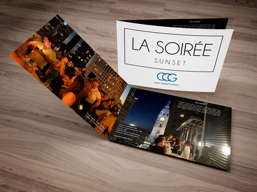
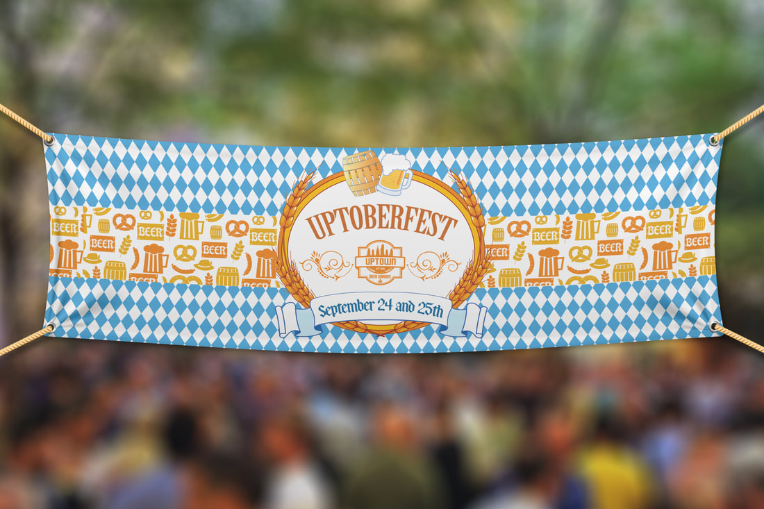
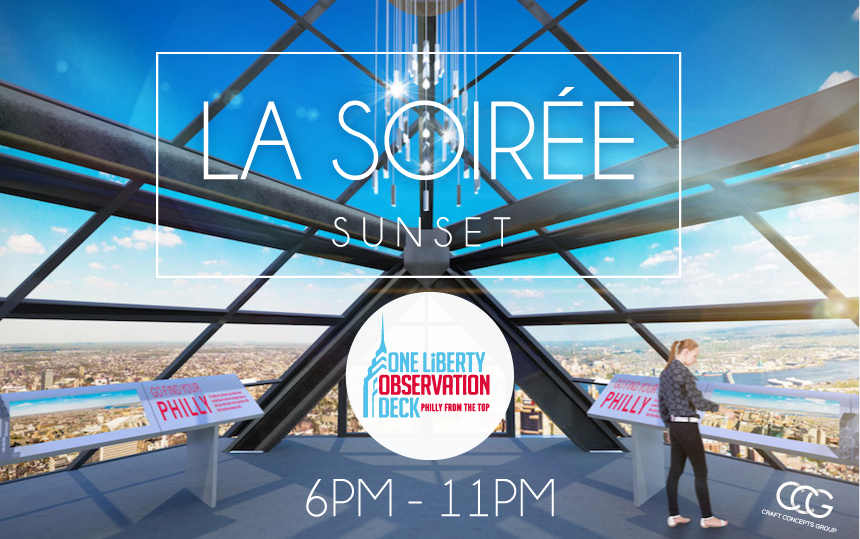
CCG incorporates Bru Craft & Wurst, U-Bahn, Cinder, La Soiree and Uptown Beer Garden. Variety of design work provided including flyers, press packages, custom Snapchat filters, gift cards, banners, and more.


Sarah Car Care
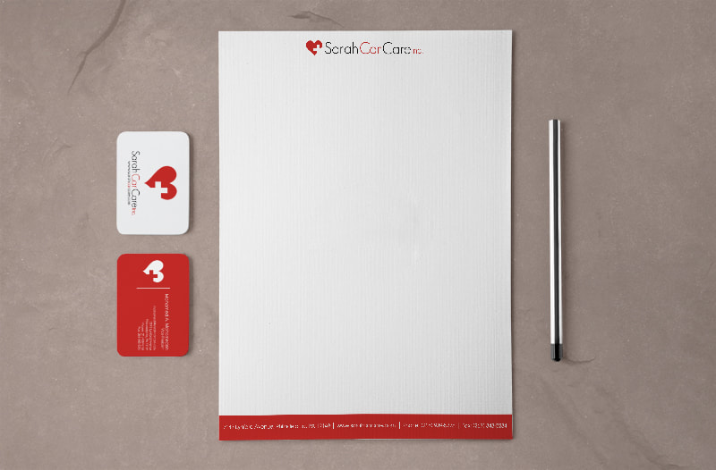
Non - emergency medical transport company wanted to go through a re-branding effort to bolster image and increase profits.
Non - emergency medical transport company wanted to go through a re-branding effort to bolster image and increase profits.

Other sampling of work:


|
|
|
|